Over in Spain, languishing at the lower end of mid-table in the Segunda División (at the time of writing in Winter 25/26) is a team called Granada Club de Fútbol.
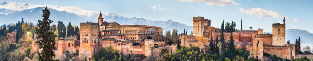
Granada is a city at the foot of the Sierra Nevada mountains (the second highest mountain range in Europe) in the region of Andalusia and it happens to be remarkably pretty. There are two reasons for this and in no particular order they are:
- The city has lots and lots of very beautiful medieval Moorish buildings lining the streets, topped off with the Alhambra; a stunning palace/castle of the Moors that also lends it’s name to a tasty beer.
- Mountains look good.
So that’s enough set-dressing. Back to their football team! I am a barely-involved fan of Granada, having spent a chunk of time nearby as a kid. The choice for my Spanish team was between them, Malaga (where I’m also familiar with) and Cádiz (because they wear yellow). In fact I’m so barely involved that I was shocked to see how far they’ve fallen in the Spanish league system. I swear I turn my back for one second and all of a sudden you’re potentially challenging for relegation into the third division. Madness.
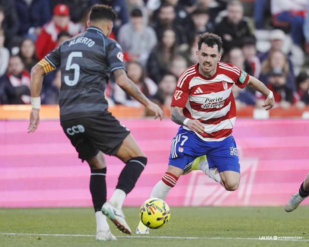
Their kit, however, remains consistent. As is the curse of most teams that play their football in hooped or striped shirts, other than the thickness of the lines themselves, there really is very little leeway to push the boat out on the design front. Inter Milan have tried their hardest and to their credit actually landed on a few of those occasions, but success stories for teams in this boat are very few and far between.
With that in mind, what did I come up with?
Bringing to mind those mountains I mentioned earlier, the three highest peaks – namely, Mulhacén, Veleta and Alcazaba – make up the white bars running horizontally across a red shirt.
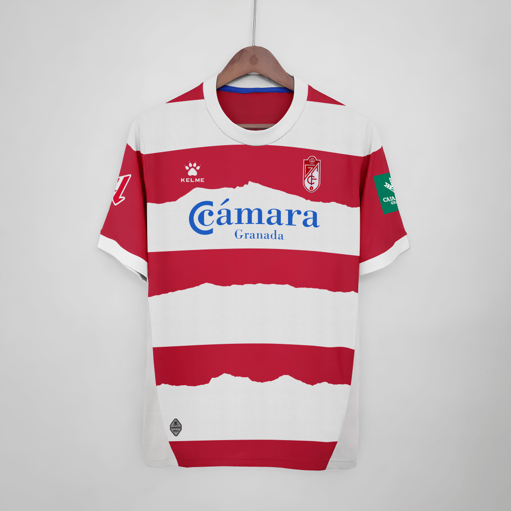
While there is another white bar running across where the collar is, I think it’s important for the balance of the shirt that the shoulder panels remain symmetrical; hence why I left that one mountainless.
You might also notice that I switched the kit manufacturer from Adidas to Kelme. That’s just a personal preference of mine. There may be a day where I go into the reasons behind my personal vendetta against Adidas. Not today.
Truth be told, this is an old design of mine that I was very happy with at the time and remains one of my favourites to this day; Hence the remastering. While aesthetic designs for aesthetic’s sake have their place, I do really like when local history, geography and culture is taken into account in regards to kit-design. The first person to use a two-tone map of an area for the design of a shirt was really onto something. It’s just a shame that that particular idea started being used for some very unromantic places. There’s a Wycombe Wanderers training shirt out there with the map of High Wycombe on it. Sure, England’s oldest Free House is on there somewhere close to the right armpit, but that’s not even in High Wycombe, really. It’s in Beaconsfield!
Let’s just be glad they didn’t do a map kit for MK Dons. It’d end up looking like a plaid shirt.
Anyway, I hope you like my Granada CF home shirt concept. I have another home shirt for Granada ready made, but I’ll try to spread these out a little. Until next time, have a good one.

Leave a comment