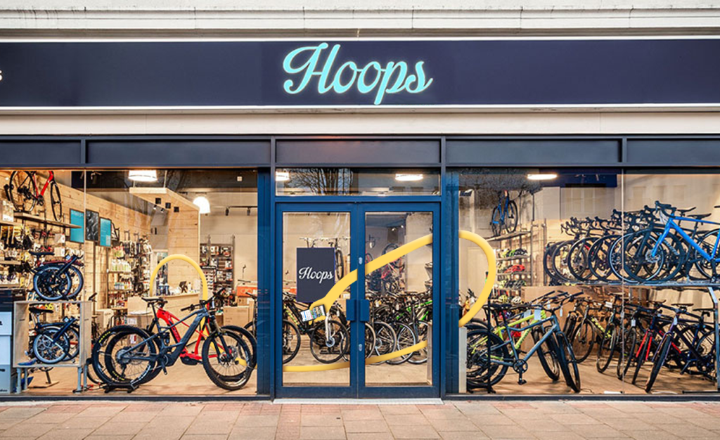
Hoops (the branch near me specifically) is a bike shop here in Surrey that I work with. For the most part I’ve worked on their Instagram account, but there has been a decent chunk of visual merchandising in the mix too.
The shop has recently been blighted with unwelcome competition, in the shape of a global conglomerate opening literally across the road with, seemingly, the express intention of shutting Hoops down and being the only bike shop in town.
That’s where I came in. Nothing groundbreaking was required, just a refresh of the Instagram page and lots of posters for the shop window, as well as a window display that I took upon myself to conceive, design, source all of the parts and build onsite.
The latter visual merchandising will be shared later, but for now, I’ll show some of the Instagram stuff.
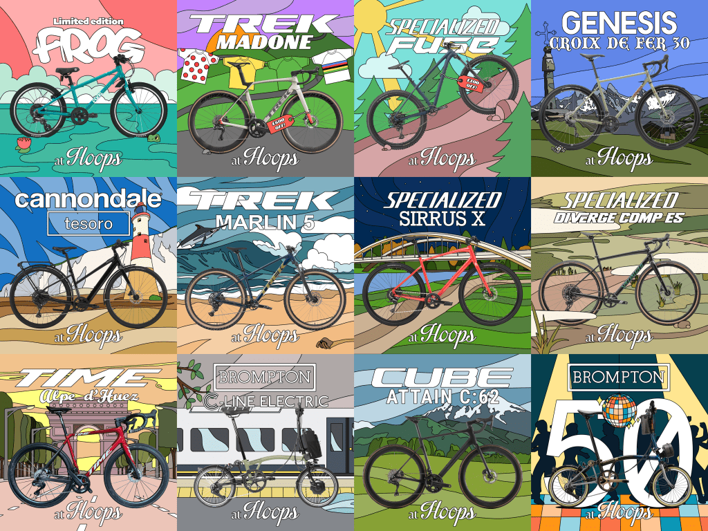
Each individual square is it’s own post about a particular bike the shop was/is selling, accompanied by relatively lengthy descriptions regarding them, written by myself. The backgrounds and general attitude of the tiles are supposed to reflect the bikes within them. For instance with the Brompton C-Line, it’s in front of a commuter train on a dreary day in the UK (very much the Brompton experience), where as for the Time Alpe d’Huez, we’re in front of the Champs-Élysées, where the Tour De France finishes, fitting for a high-end road bike.
I’m not really a bike guy. I ride around something called a Sun Snipe from the mid-60s that I bought for £12 off eBay and fixed up/made worse and painted myself. It turns out that a lot has changed in bikes over the last 60 years, so writing those posts required a lot of learning. This is one of those things that I’m not sure if it’s general knowledge that most people acquired a while back, thus is embarrassing for me to admit, or if it’s niche knowledge for nerds, but I really had no idea that basically all adult bikes have disc brakes now. Like a car! A lot of the fancier road bikes also have electric gear-shifting. It’s wild. Pushbikes are turning into motorbikes, and that’s without going in to the whole e-bike movement. The less said about them the better. I know so much about torque and newton-meters and watt-hours now.
While the next thing is technically visual merchandising, which is specifically what I said I would not be sharing yet, the whole vibe of it fits in a lot more with the Instagram posts, so (aesthetically at least) I think it’s more pleasing to share it here.
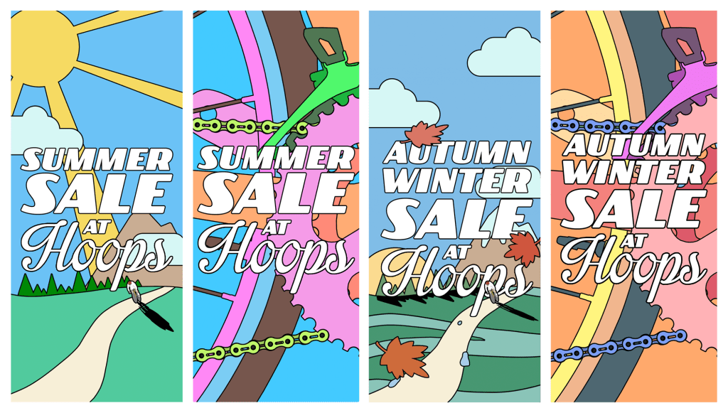
These are sale hangers, which you may have already guessed hang from the handlebars of certain bikes to indicate that they are part of a sale. They’re printed onto nice glossy paper and gently flutter around under the air conditioning of the shop.
Now, there would have been a more pleasing symmetry to these hangers if the Summer sale was the Spring/Summer sale to match the following Autumn/Winter sale, but the cards weren’t dealt in that manner.
I do think I represented the seasons changing fairly well though, with just a few leaves and a palette adjustment, all the while keeping the visual language the same and having them remain eye-catching from a distance within the shop.
Squares and rectangles. That’s what I’m all about.

Leave a comment